Overview
In order to keep pace with emerging technologies in the marketplace, and demand to provide automation and integrated services; a strategic initiative was formed within a large financial services firm to transform and continuously improve investment related documentation, transactions, and business processes, and internal team member experiences with a product that aims to transform the way users currently complete work related tasks.
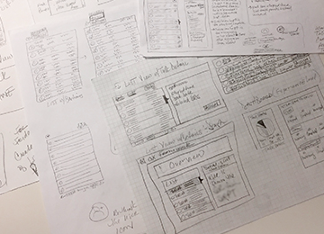
Product design sketches for the application
Challenge
Disparate processes and data minimize effectiveness in processing work to be completed; team members and business managers need an improved and modernized application for the end-to-end process of managing work, deliver a flexible MVP.
Role
Role: Sr. UX/CX Interaction Designer
Timeline: 1 year, 7 months
Platform: Web Application for Enterprise
Team: 2 UX Designers, 1 UX Researcher, 1 Product Owner, 1 Scrum Master, 3 Tech Leads, 8 Engineers, and 4 QA & UAT Testers
Timeline: 1 year, 7 months
Platform: Web Application for Enterprise
Team: 2 UX Designers, 1 UX Researcher, 1 Product Owner, 1 Scrum Master, 3 Tech Leads, 8 Engineers, and 4 QA & UAT Testers
Approach
Results
Design Thinking Processes & Methodology
Cross-Enterprise Focus Groups & User Interviews
Affinity Mapping
Feature Prioritization
Validate Data & Simplify Processes
Automate, Consolidate, & Centralize Information
Modernize the UI
User Testing
Cross-Enterprise Focus Groups & User Interviews
Affinity Mapping
Feature Prioritization
Validate Data & Simplify Processes
Automate, Consolidate, & Centralize Information
Modernize the UI
User Testing
The MVP delivered a variety of features to help users manage, assess, and actually perform their work; including a centralized place to see all of this information and was initially rolled out to 3,000 team members.
The Process
To help us understand what we were building, and for who, we used User-Centered Design and Design Thinking methodologies to collaborate with users, business partners, and stakeholders.
We held cross-enterprise focus groups and discovery sessions where we spoke with team members about the work they do and how they complete their work.
Validating Data - What is Actually Important?
Paying special attention to important attributes to our user base, we wanted to find a way to reduce the number of data points we were asked to include. To get down to what was absolutely necessary, while providing visibility into work without hindering users from completing tasks, we held "Buy A Feature" activites.
Research results were clear, users overestimated the amount of data points they needed. Our conclusion was that we could reduce the number of fields and maintain functionality in a design.
Getting to Work
Design and Test the MVP
Design and Test the MVP
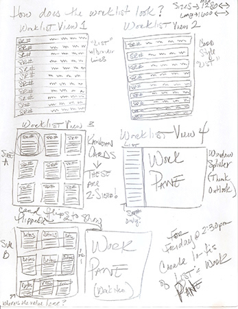
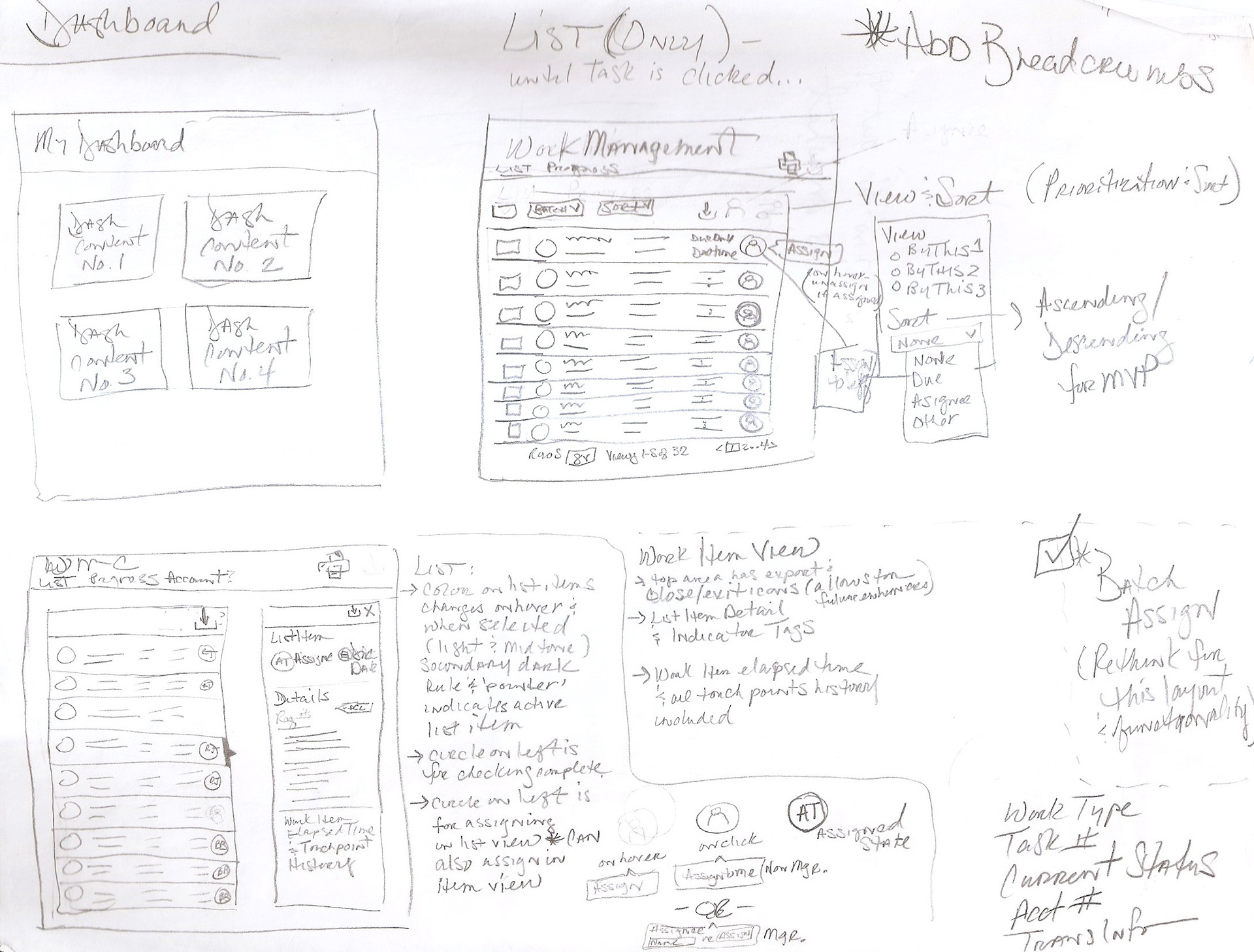
Our next step was to think through designing a list with less data fields and take it back to users so they could gauge the amount of information we were delivering, and we could get feedback.
Early UI Sketch
Early UI Sketch
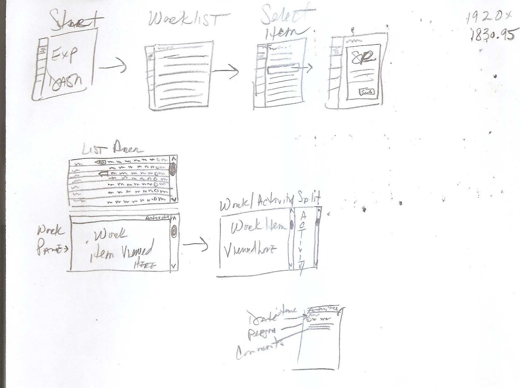
Thinking through flows
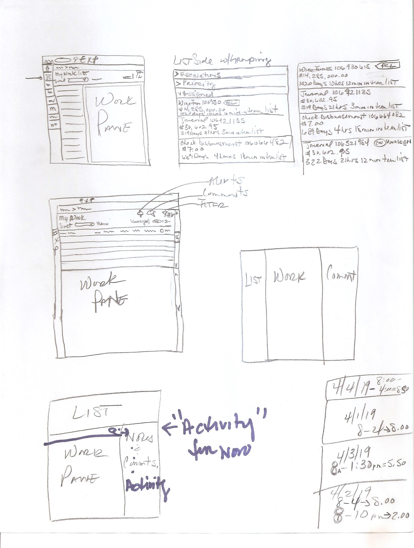
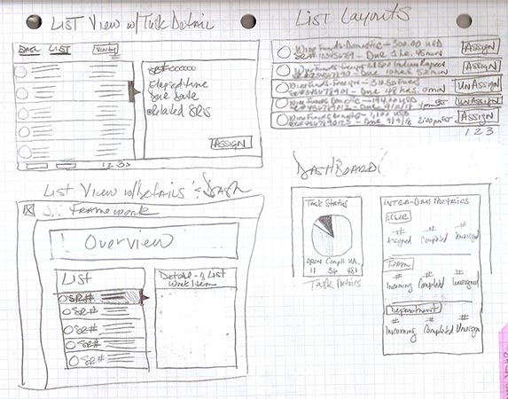
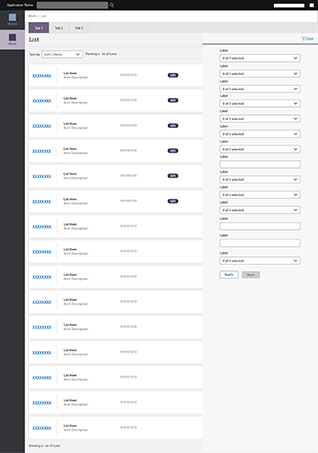
Refining my sketches, I created a layout that reduced the number of data points, while delivering the necessary information about the work.
A pane accessible by clicking on an item, contained specific details about the item. In addition to the core product and detailed information, controls were created with sorting, filtering, and batch selecting options.
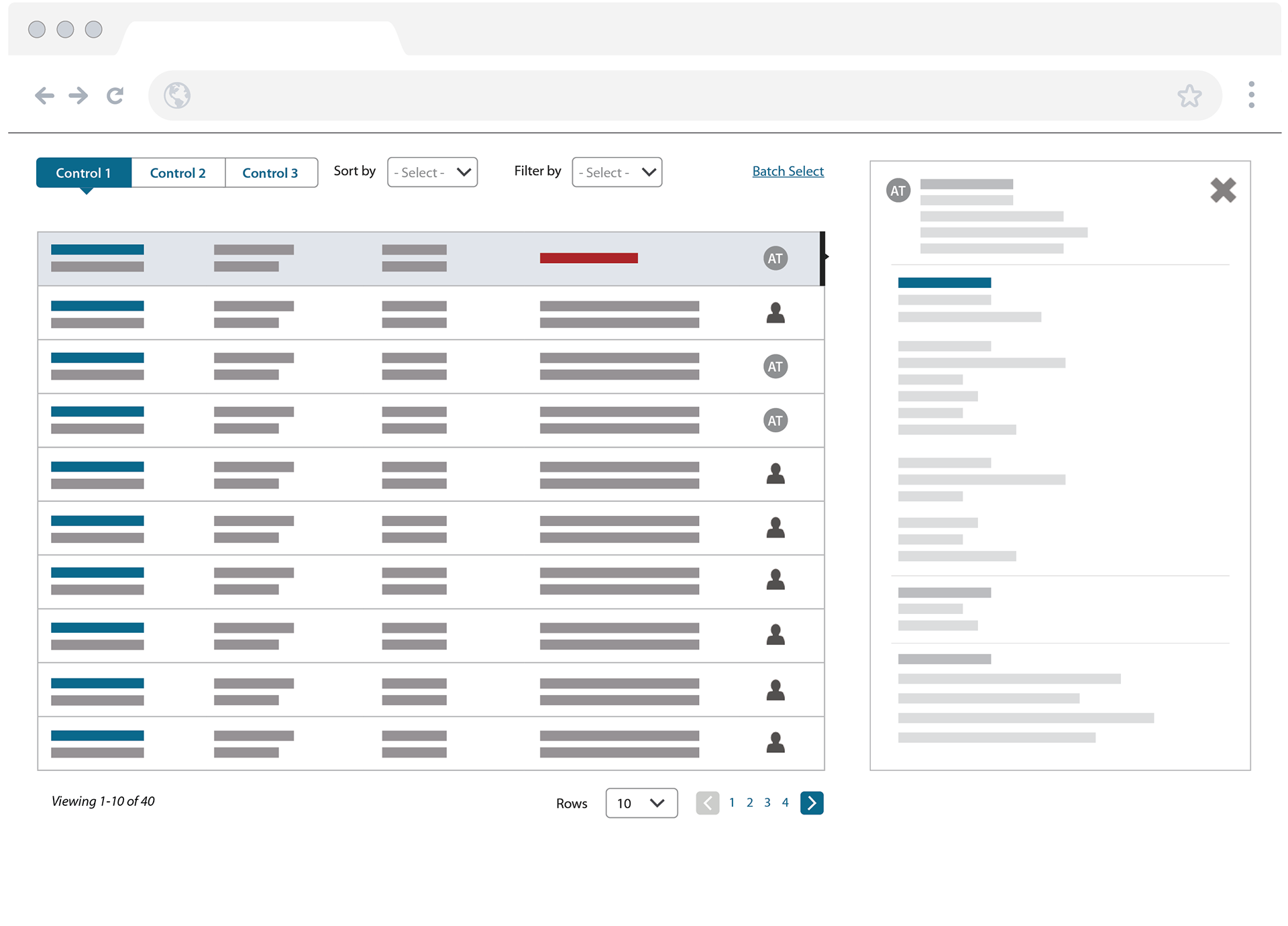
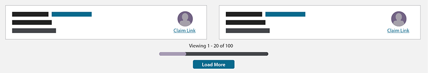
MVP 1 Wireframe
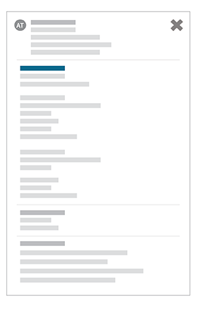
Expanded Information Pane
Simplifying the Process
Ending Duplicative Work
Ending Duplicative Work
One of the biggest design challenges faced was to help prevent team members from attempting to work on the same requests and duplicating efforts. This included complex technological implications to simple design choices that I worked through with users and technology partners. I was able to successfully limit what was a complex process down to "one click."
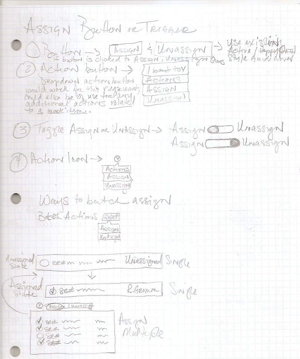
Assign Sketch
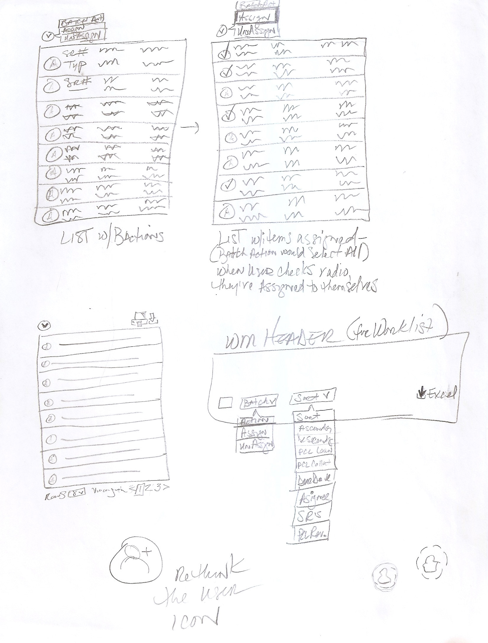
Batch items sketch
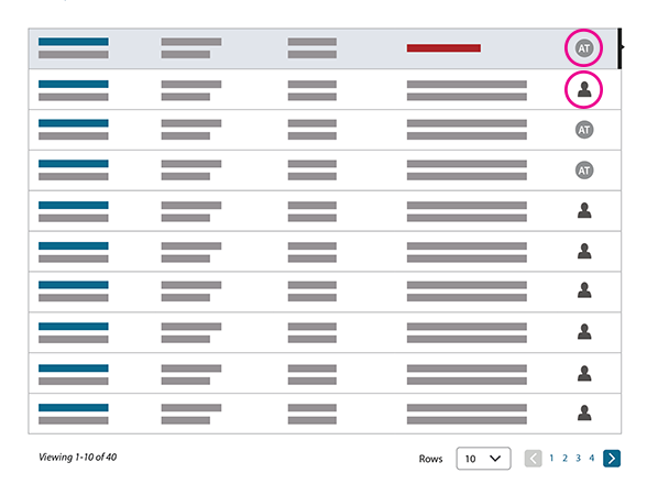
Incorporating icons helped to differentiate team members and unassigned tasks.
With a revised MVP design complete, we were ready to test the new layout. During testing we gave team members task-based scenarios that mirrored their daily activities to complete, and were also looking to discover the participant’s perception of our execution of attributes and overall usability of the interface.
What we were we trying to learn:
Is the information hierarchy easy for the participant to understand?
Is the overall core functionality of the product easy to use?
How can the functionality be improved?
The MVP design scored a 7.6 out of 10, and several comments were made about the simplistic design and efficient approach - validating our exploration into the fields needed and the simplified assignment process.
Design Iterations
Card-based Design
Card-based Design
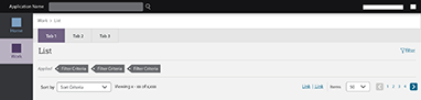
After testing our first prototype, further design and research discovery sessions took the design in a new direction. Working to move away from the current format, which still felt like a table, I explored a card-based layout allowing for a flexible design component that could keep up with ever-changing data and the needs of various user groups.
Our new card design could be viewed as a 1 or 2 column page, and new toggle icons for these 2 views were created. When viewing the 1 column, the pane is always visible and accessed by clicking the card. When in a 2 column view, the user can see the details of an item by clicking on the card which activated a fly-out pane containing detailed information.
Revised Card Design Sketches
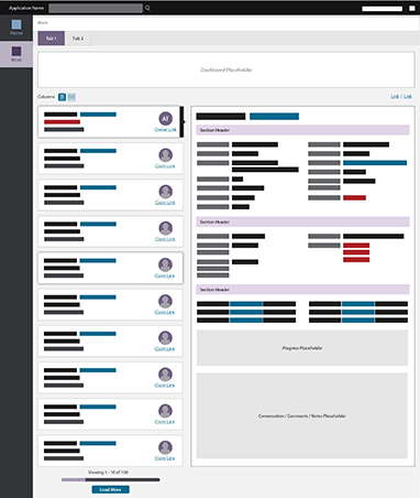

In the new card layout, we further removed data points from the cards.

Next we needed to expand the data found in the pane; I added section headers to lend a clear hierarchy for the data. Placeholders for future features were included.
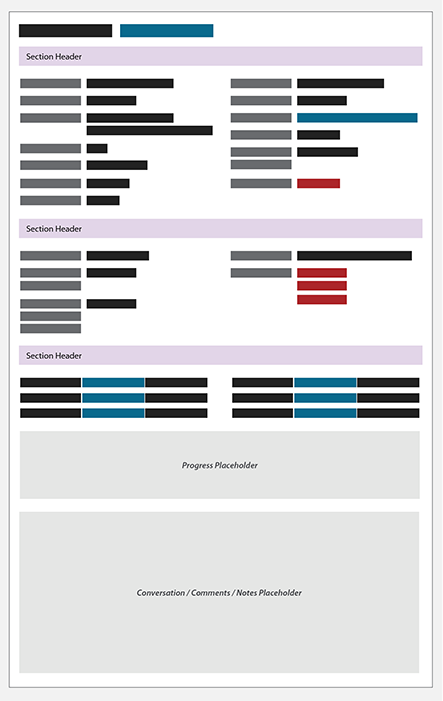
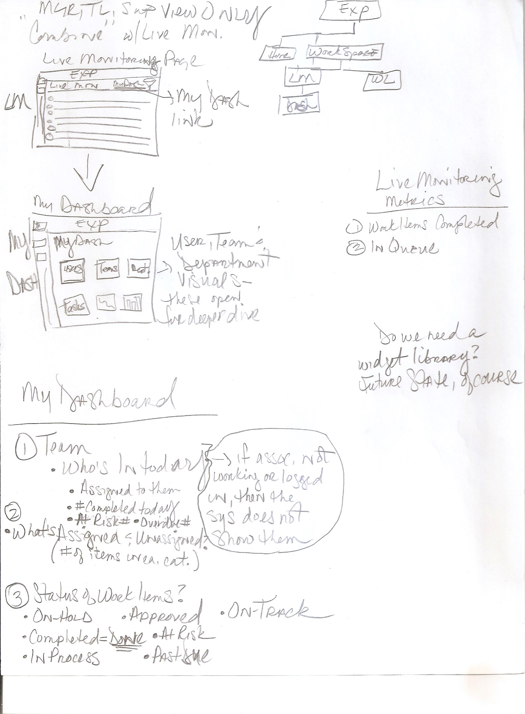
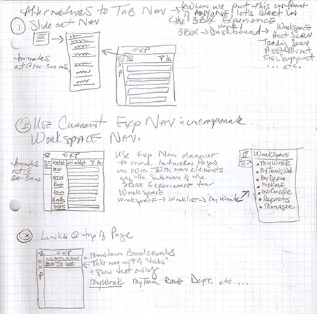
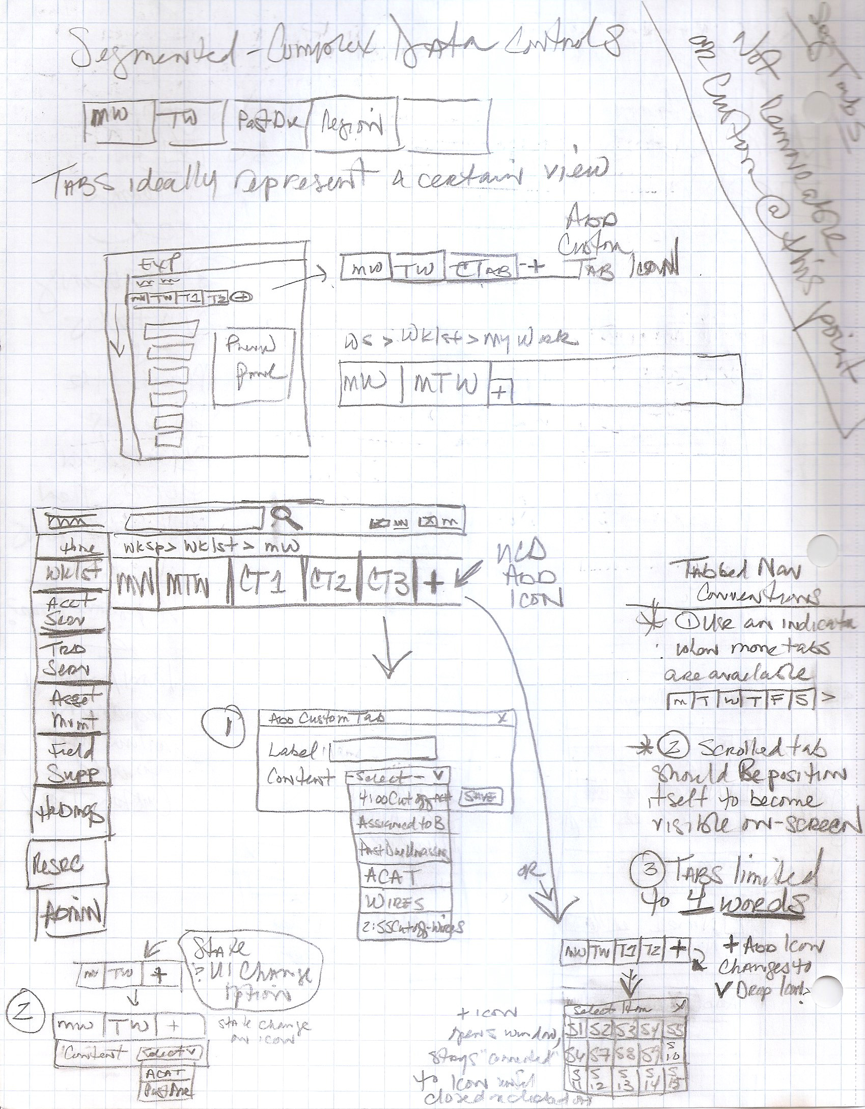
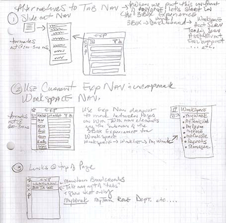
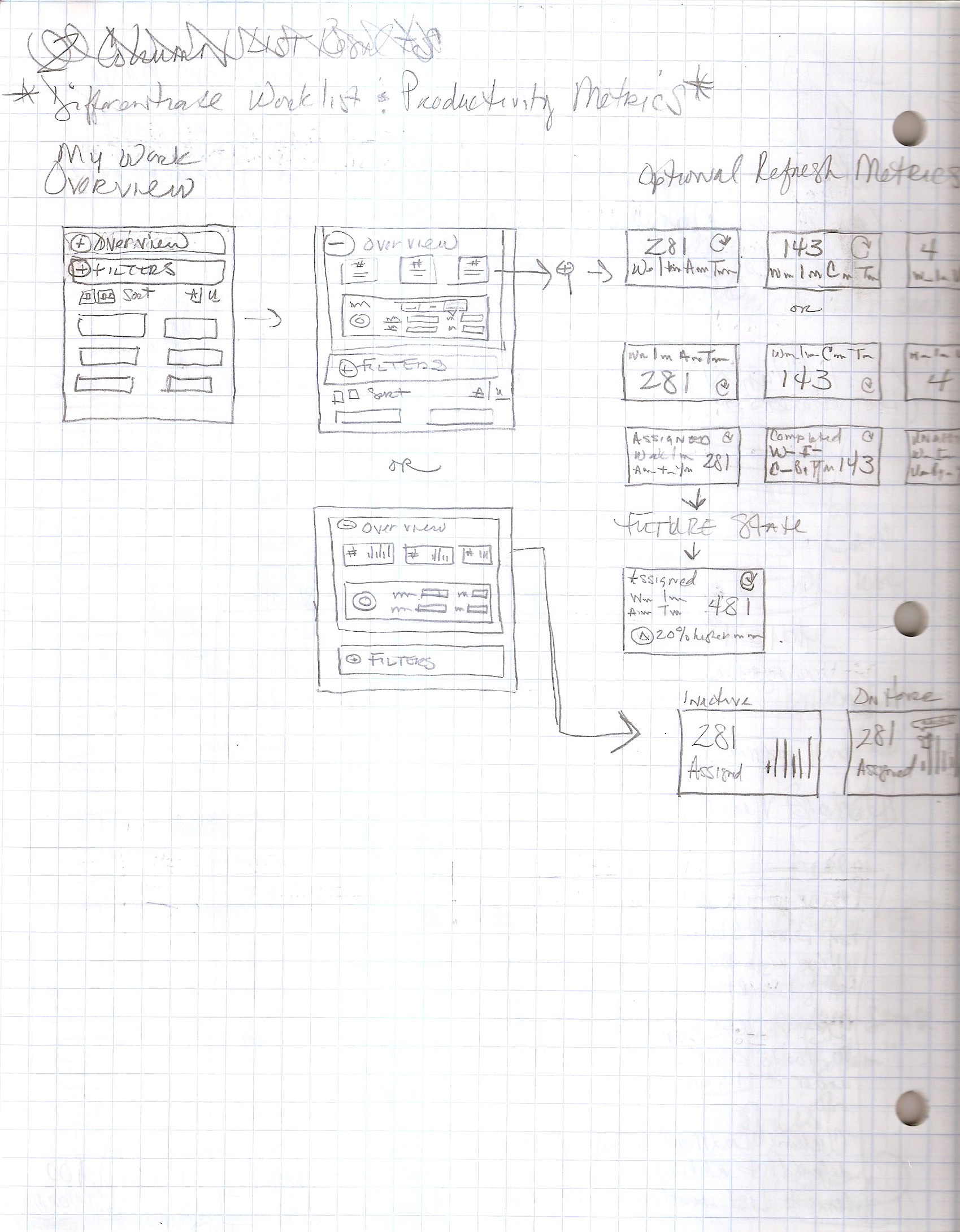
During this iteration, a dashboard was added and the design was expanded to include links in the UI allowing for batch actions on the current page. In preparation for user permissions and entitlements as information would begin to populate the product, tabbed navigation features were added so users could toggle between different card views.

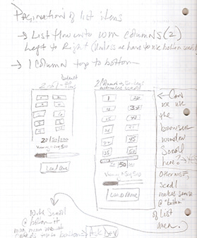
The product houses many items, with work coming into the system at all times throughout the day. To offer users visibility into their work and to give them the ability to navigate multiple pages within the product, a modern pagination feature was explored to further update the interface.

Having created new prototypes, we once again tested our new design. The redesigned list scored higher than our previous MVP at 8.23 compared to 7.6 of iteration #1. Participants found it easy to understand and interact with, and the Pane functioned well with no issues around how to access it or finding information.
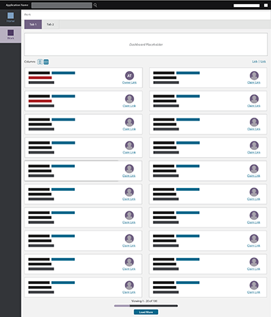
Participant comment, “If this was rolled out to me tomorrow, I would be okay with it, it’s clean, sleek, to the point.”
Having received positive feedback from team members, we felt that we were on the right track with our design. Research findings were presented to our business partners and we gained our approval to start development of the MVP product with our pilot group of users.
Minimize My Results
Filters and Filter Tags
Filters and Filter Tags
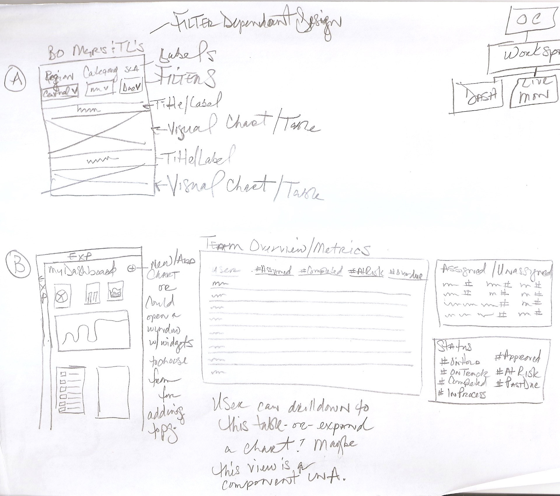
With our MVP in development, we started to work on adding more features and value for our team members. To allow users to minimize the amount of results that could be shown within the product, as we begin to add more features into our application, a filtering system was created that would give them the ability to filter within the product to see only items that pertained to them.
With direction from our business and IT partners, along with SME’s, who informed us on the content of the filters; we collaborated through many whiteboard and sketching sessions to explore how we might design a filtering system that was robust enough to offer an efficient way to filter information within the product. We went through a few rounds of filter exploration, as we worked through accommodating the new filter feature, while preserving visibility into the maximum amount of list results, we landed initially on keeping filters at the top.
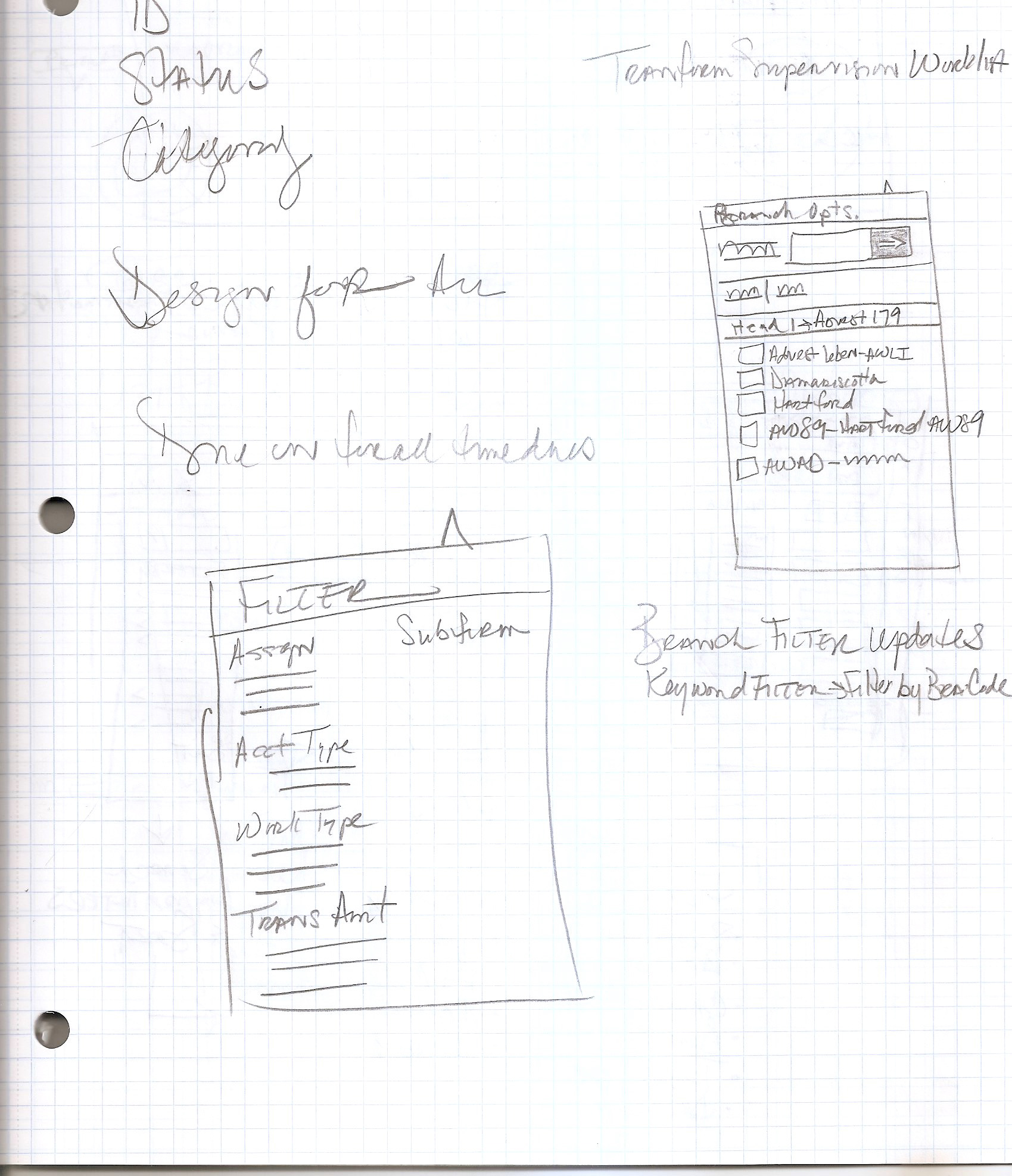
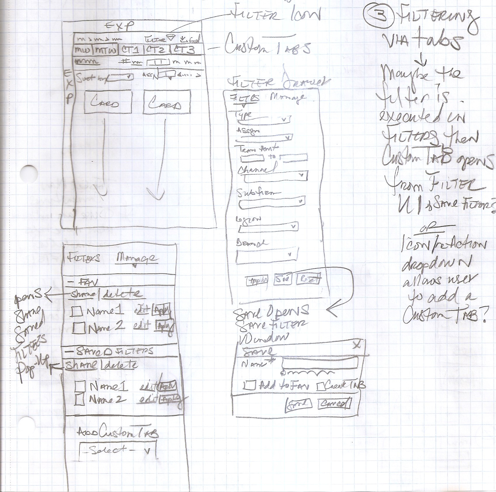
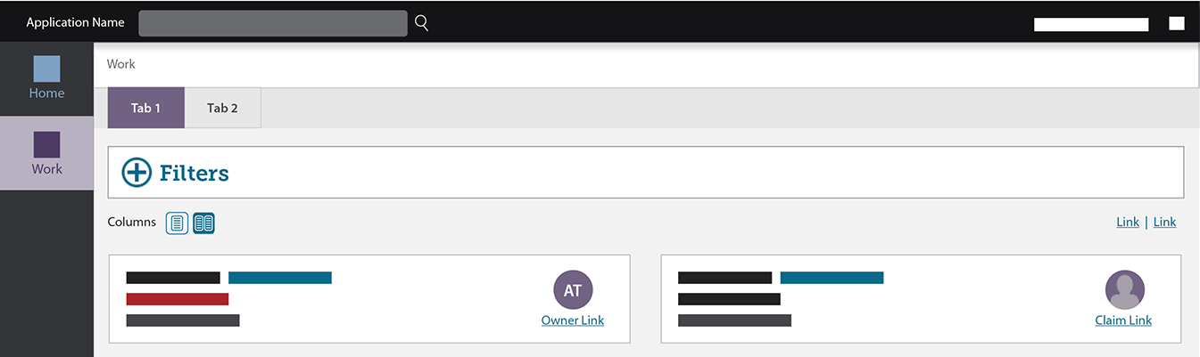
After further exploration, focus groups, testing, and feedback from our product owner, it was decided to rethink filters, consider alternates to tabbed navigation, and card design. Our filters moved from the top of the list to a fly-out on the right side, and our cards were redesigned to give us maximum real estate on our screen. Ultimately, our tabbed navigation did not change.
At this time, we also started to explore Saved Filters, how they might work, and what they might look like.
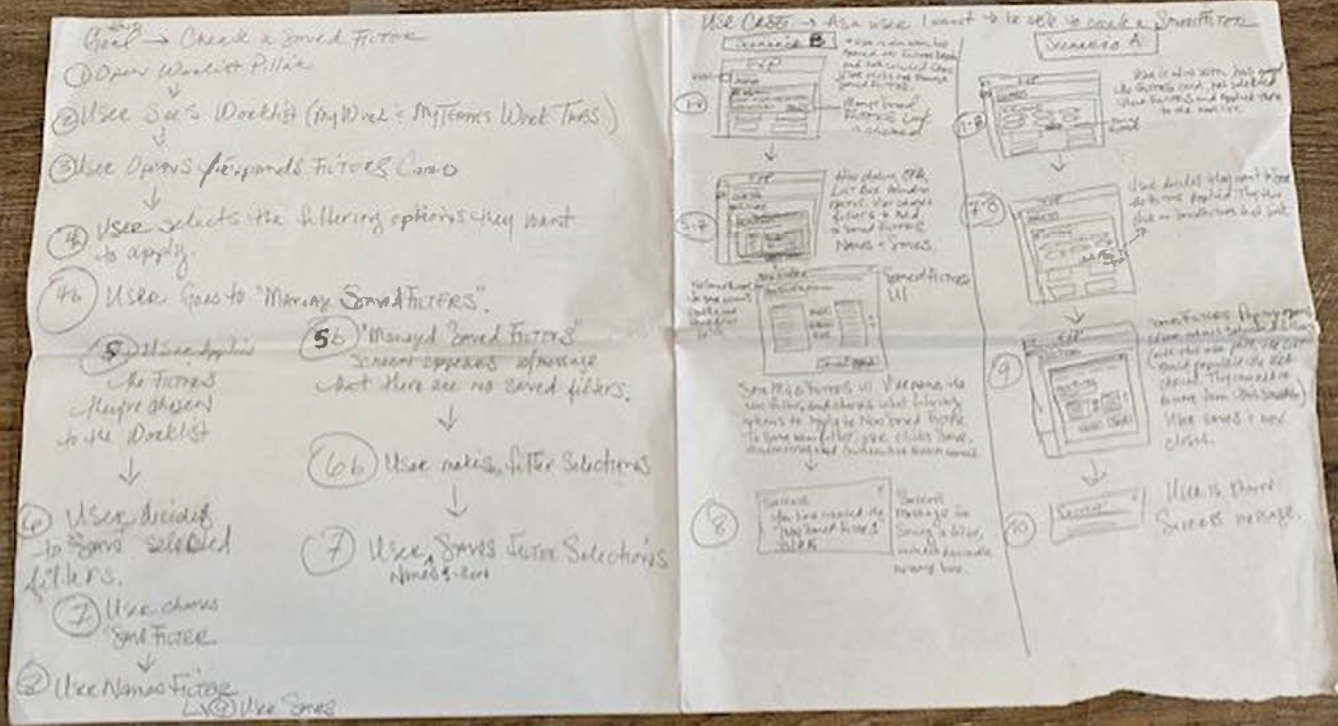
Saved Filter flow scenarios sketch
To help teams with remembering what filters had been applied, tags showing each filter criteria were added to the UI. Tags only show when filter criteria has been set. All tags are removable, adding further flexibility to quickly edit filter criteria on the fly.
Real-Time Productivity
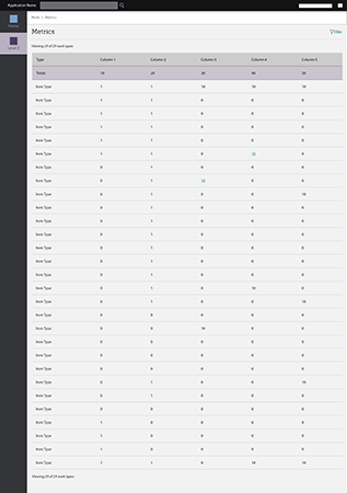
Metrics and Data Visualization
Metrics and Data Visualization
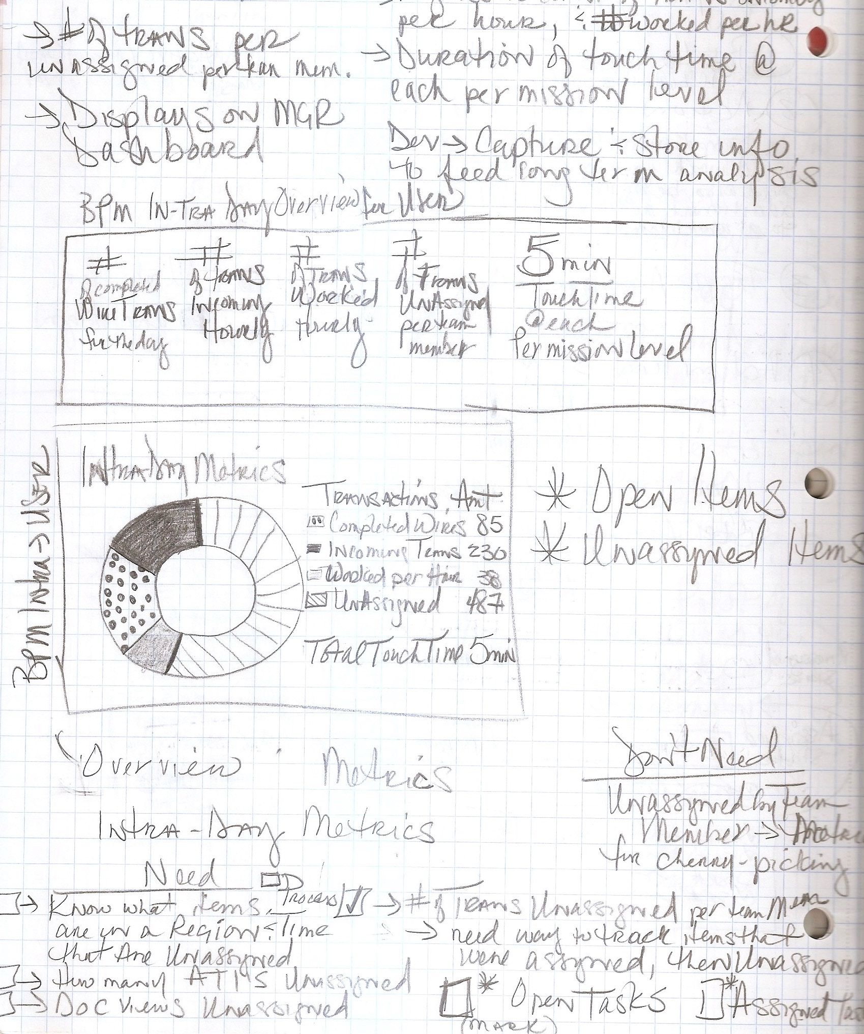
Team members of all levels want visibility into the right information in the product. Teams needed to be aware of what is coming into and going out of their departments, and we began to solution a way to give them real-time visibility into their daily productivity.
We went back to research these needs by holding Design Thinking sessions with team members. Our goal was to gather priorities by engaging participants in discussions about what their daily priorities are, we also had them participate in an activity to display their prioritized metrics goals.
Research Methodologies
Bullseye Diagramming
Bullseye Diagramming
To gather priorities and recognize their top needs for metrics, we paired participants by their user roles and gave them sticky notes to write down what they valued. We then asked them to place those stickies onto our Bullseye Diagram prioritized by primary, secondary, and tertiary importance.
Build Your Own Prototype
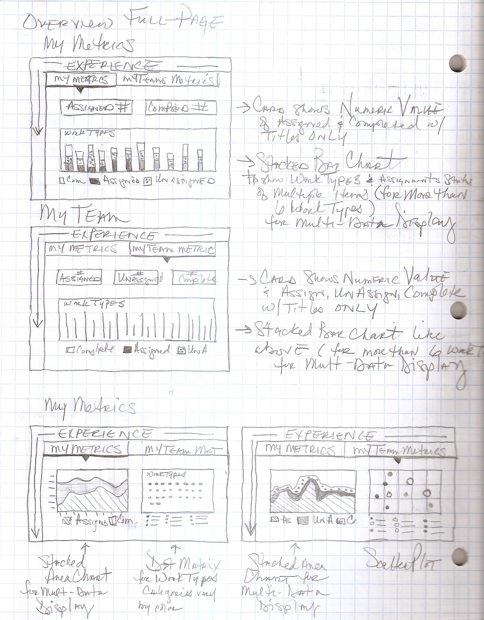
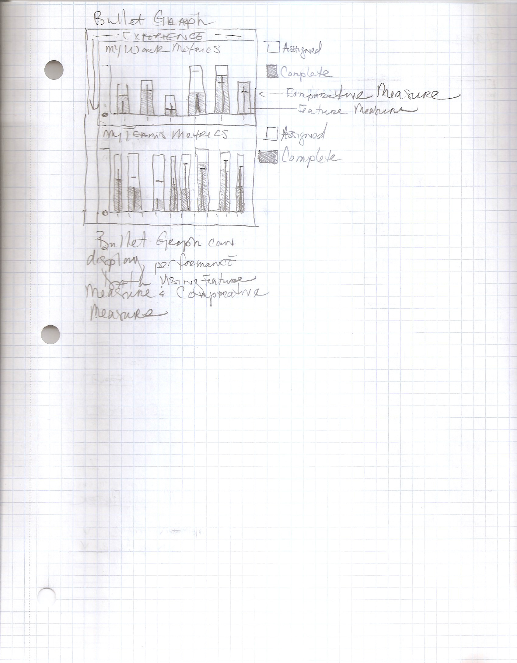
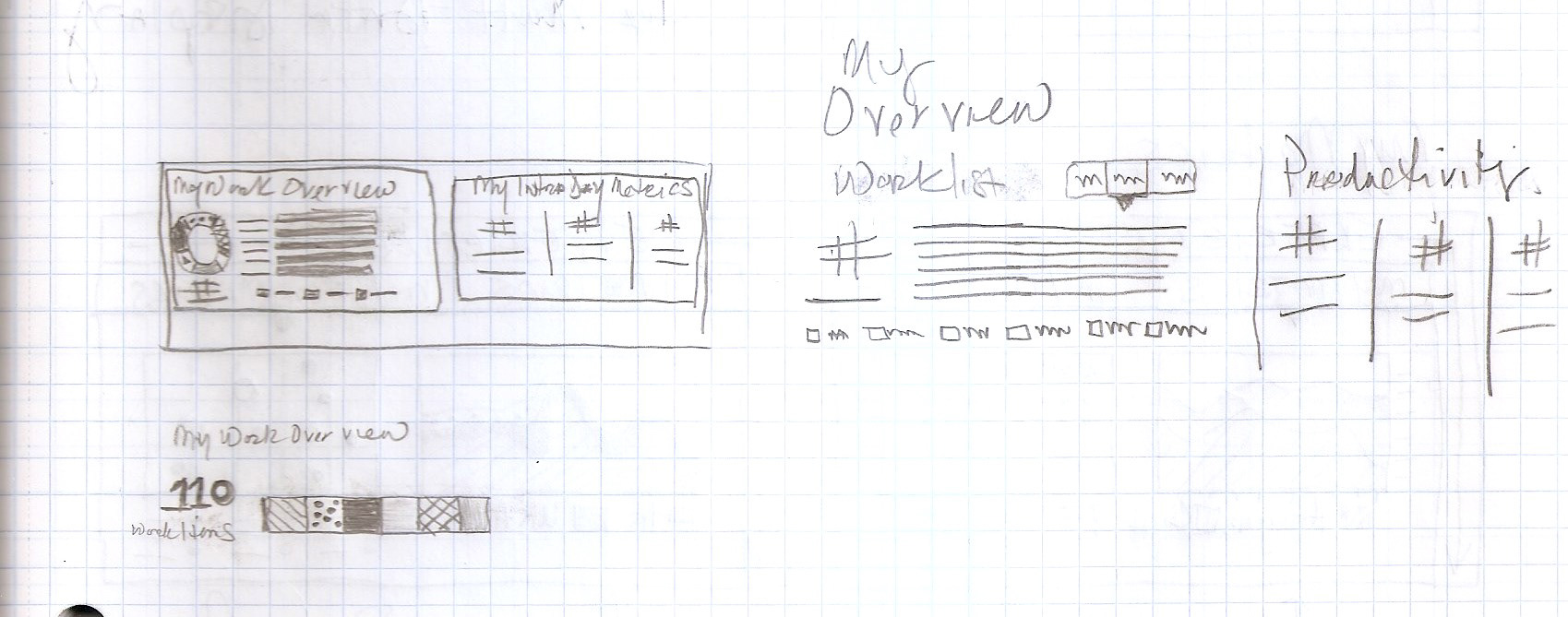
Next, I created 12 examples of charts on paper to use in the Build Your Own Prototype activity to give participants inspiration and the ability to create their own metrics visuals. We asked them to create metrics for 3 scenarios:
Historical Data Chart - Over time, what do you need to see?
Comparative Data Chart - What sort of information do you need to compare?
“Dashboard” - What information do you want to see in an overview?
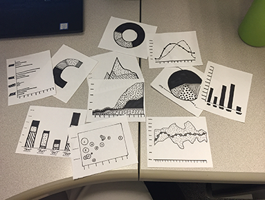
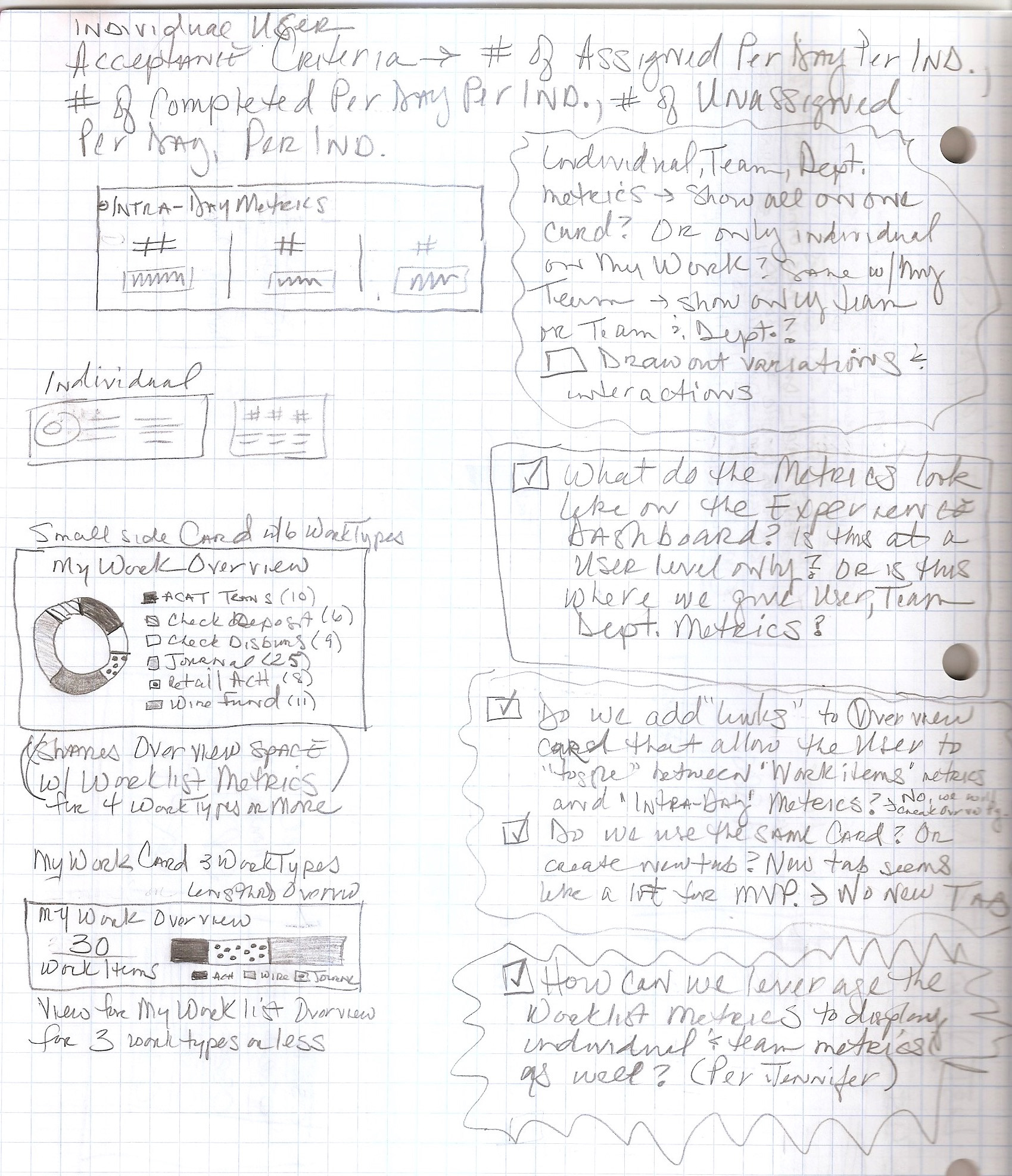
Though there are similarities in the charts that participants chose, we learned that there are a variety of needs between the different user roles, we then designed concepts for a Metrics page to provide them with that flexibility.
Insight into Priority
High Priority Indicators
High Priority Indicators
Team members needed to be easily informed when something was considered high priority, as they may need to adjust their approach to that item. Working with the Product Owner to address these situations, I created high priority indicators signifying to team members a need to prioritize these items. In the design we are now able to keep users from having to take extra steps before being able to address this critical work.
Leveraging badges and tags in our design system, I was able to create a badge that is highly visible and gave our users clear insight into high priority items.

In Conclusion
The UX of application design at enterprise scale is challenging and goes much deeper than expected. I was up for the challenge of working on a large, complex project with many working parts and design challenges to solve.
Working in an Agile environment on this project, I've been reminded how effective this methodology of development is when everyone is on board and working in cadence towards the same goal.
Having the opportunity to acquire more hands on, in-depth research and direct user interaction experience was extremely valuable and made the research and design efforts evolve quickly, resulting in immediate iterations and improvements to the UI.
The application has come a long way since May 2018, we delivered an MVP to our pilot group, and built upon and improved our UI to be delivered in future releases. Through product owners and business partners socializing our project, the application has re-sparked interest in the product throughout the enterprise.